Description
The ideal candidate will interact with the vaults, use some competitive analysis across other clmm providers, and suggest design decisions that will make Armada more accessible and exciting to use.
Highlight areas that are problematic, design new ways to present the data, suggest missing features and data points for ease of use, and explain your rationale in your final presentation.
My Review
1. main CLMM screen
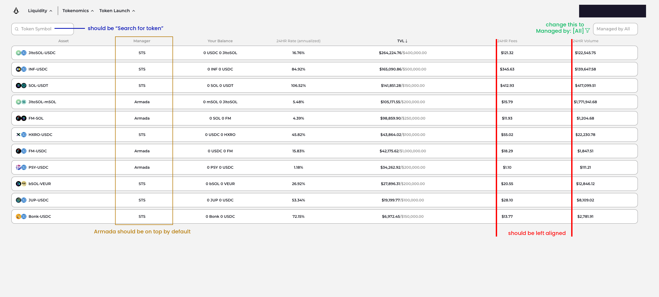
- managed by All -> Vault Manager: All + add filter button
- token symbol -> token (because token symbol is the image)
- do not use “Rate” -> APR instead + number should be left aligned
- Manager -> Armada should be on top by default
- number should be left align all (center align make the eye hard to focus on the number, which is the most important thing)
- if you’re using dark theme on social media, a dark mode should be being prioritized first
- i tried withdrawed the fund, but it very slow. It should be improved soon cause no one want to wait for 3-5 minutes and keep waiting for the button keep circling.
- we should have a separated “Your pool” if already deposited the fund. If not, i have to find my deposited pool in the list everytime i visit the page, it’s really a pain point.
2. Vault screen
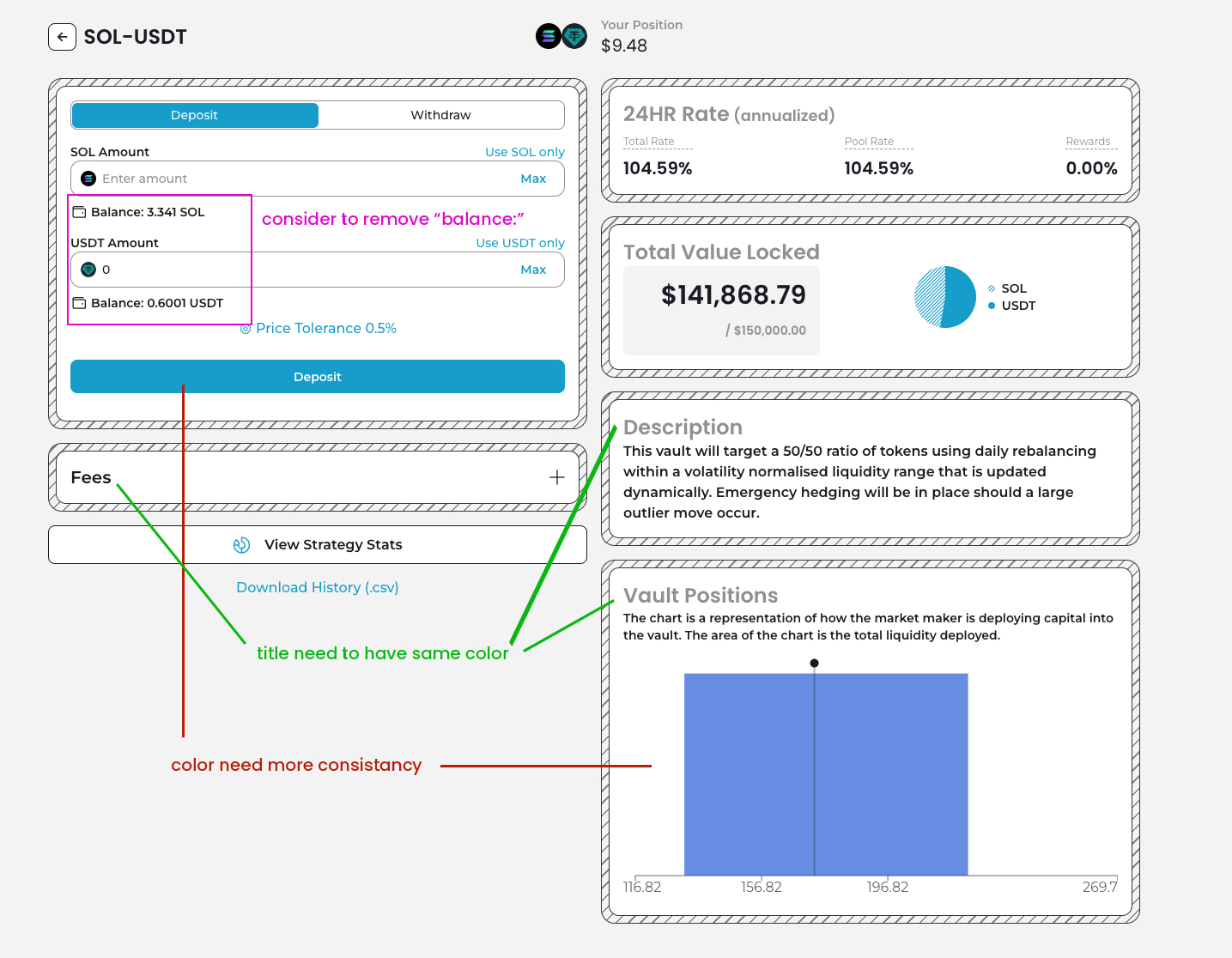
- we should have a consistant theme color (there are 2 types of blue in the design, and brand color is even green?) -> if your brand want to use green, the color on your UI need to be green also
- Balance: if you have the wallet icon, do not need to have “balance”
- Title and text color need to be more consistant
- description, vault position: grey
- fee: black?
- suggestion: use black for all title, grey for all paragraph
- Deposit & Withraw screen should have 2 different color (all blue now)
- Download History button works so slow -> consider to make a separated history page here, could be a pop-up page
- there is no place for adjusting my LP positions? I thought that a CLMM should allow me to adjust my price range to optimize my reward %
Others
Price Tolerance
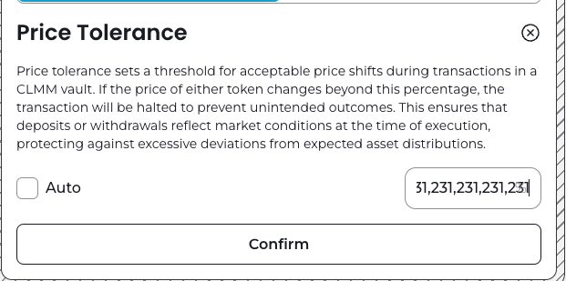
Currently do not have any limit, i can input any number.
The text should be rounded in the paragraph box (better lettering)
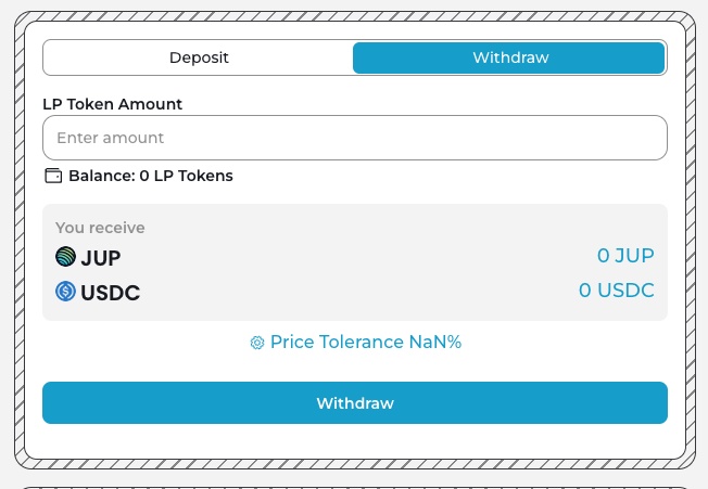
Choose a random pool, switch to withdraw (it also happens with the deposit tab) -> Price Tolerance Nan%
Modal
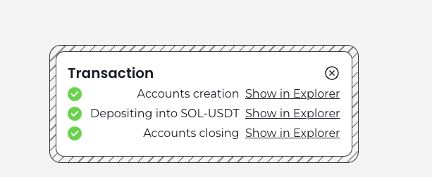
The alignment need to be improve, what will happen if the action name is longer? The appreance will be weird when that sentence is super long.
Suggestion: move to the right corner, left align the next.